
Lightning Components is a UI framework for developing web apps for mobile and desktop devices. It’s a modern framework for building single-page applications with dynamic, responsive user interfaces for Lightning Platform.
In lightning components, a component is a bundle of code. The bundle contains all the resources related to a component like javascript controller, helper, renderer, css styles etc. A basic lightning component contains the design of a page in html with some lightning tags. The component uses JavaScript on the client side and Apex on the server side. The javascript code is written in the controller, helper and renderer part of the component bundle.
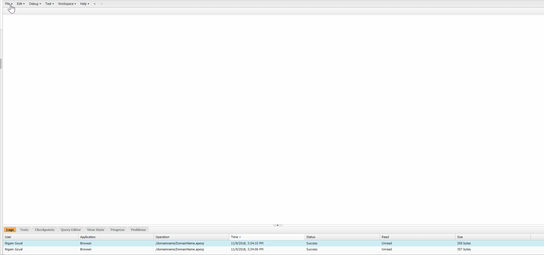
To create Component: Open Developer console, Goto New > Lightning Component. Give name and description for your component and your component is created.
Resources of a lightning component :
- Component
- Controller
- Helper
- Style
- Documentation
- Renderer
- Design
- Svg
Component:
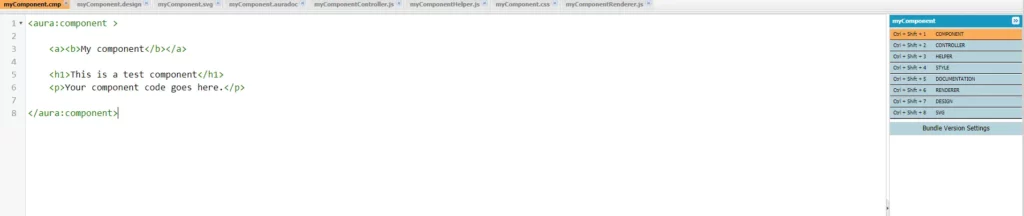
It contains the html like code of a component along with some lightning tags. The component code is written in <aura:component> tag. Whenever your start building your component, you start by writing your component design.
Controller:
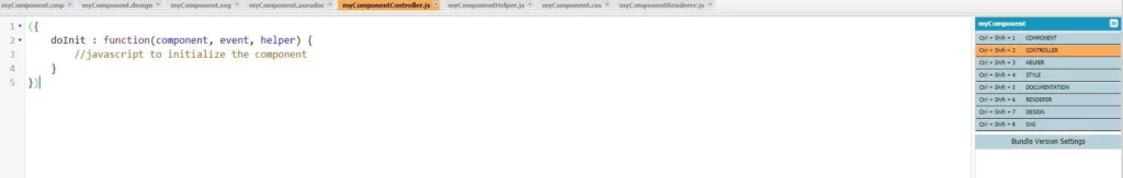
It contains the javascript code for your component. It takes a doInit method that runs before your component html content is loaded (doInit is not required).
Helper:
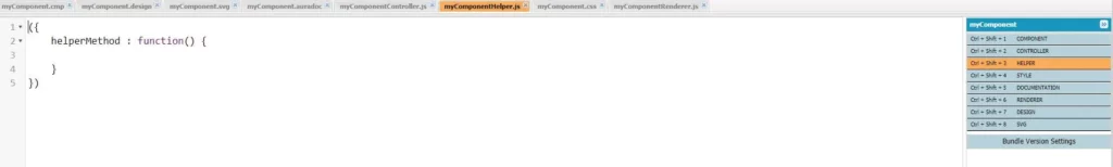
It contains the javascript code for your component just like your controller but the purpose of helper is to segregate the calls to the server. The methods defined inside helper can be called from the controller and renderer, hence making it more reusable. You write those methods in helper which are basically reusable and may be required to be called multiple times. So it is best practice to separate your client side javascript from your server calls as the server calls run asynchronously.
Style:
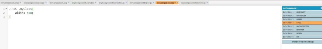
This style resource contains the custom style classes that you are going to use in your component.
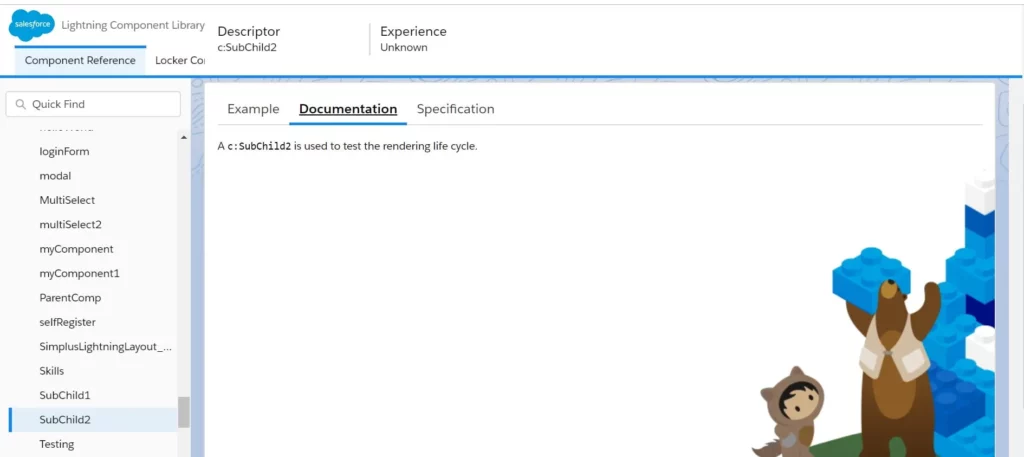
Documentation:
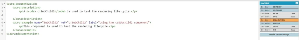
It contains the basic documentation of your components so that is easy to understand for someone who is using your application. The documentation you create will be available at the lightning component library. To view the documentation of your component you have to link your org to component library.
Example:
Renderer:
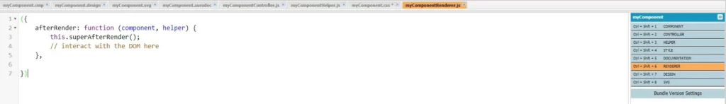
It contains code that you want to execute before or after rendering of your component elements. You can make calls to your helper methods also in renderer. The rendering behavior can be of four types i.e. Render, AfterRender, Rerender and Unrender.
Render:- render() function is called when the component is being initialized. This function returns an array of DOM nodes.Use render function to modify DOM or to modify component markup.
AfterRender:- afterRender() function is called by the framework after the render() function.AfterRender function allows us to further change an already rendered component. The afterRender() function enables you to interact with the DOM tree after the framework’s rendering service has inserted DOM elements.
Renderer:- Rerender function will be called when a component’s value changes due to user action like a button click or some other event like component/application event. Rerender function updates component upon rerendering of the component.
Unrender:- Framework fires an unrender event when a component is deleted.The base unrender() function deletes all the DOM nodes rendered by a component’s render() function. It is called by the framework when a component is being destroyed. Customize this behavior by overriding unrender() in your component’s renderer. This can be useful when you are working with third-party libraries that are not native to the framework.
Design:
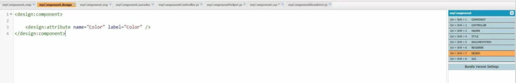
Design resource is used to create attributes that you want to use at the design time i.e. while using the Lightning App builder tool. When you are using your components on a record detail page you have the option to set some of attributes of your components to customize their behaviour. These attributes are specified in the design component.
Svg:
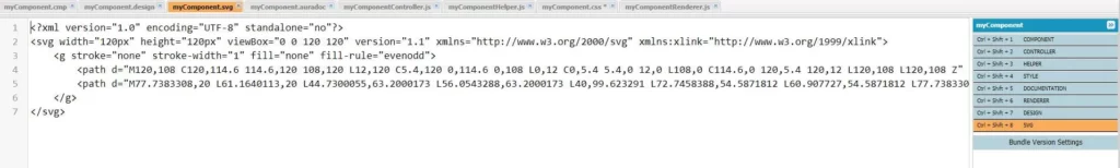
Svg resource basically contains the svg icon for your component so that when you view your component at design time(in Lightning App Builder) your component appears with the icon specified in the svg component.